It’s wild how quickly the web evolves, isn’t it? Blink, and what was cutting-edge last year suddenly feels clunky and outdated. That’s especially true in 2025. We’re seeing a serious shift in how websites look and work. Not just small tweaks, but full-on gamechangers that are transforming the way people experience your brand online.
I’ve been designing websites professionally for over a decade, and let me tell you, I’ve never seen such a blend of tech, design ethics, and human-centered thinking all at once. It’s not just about what looks good anymore. It’s about what feels good, runs efficiently, and adapts to every single user.
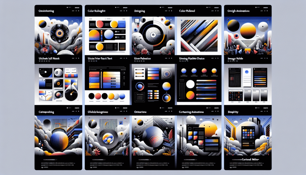
So, what’s hot in 2025? Let’s dive into ten design trends you won’t want to ignore if you want your website to compete (and actually connect).
1. Sustainable and Energy-Efficient Design
Yeah, it’s not just marketing teams going green. Designers are, too. Websites today are expected to be leaner, not just in look but in load times and energy use. Pages bloated with unnecessary scripts and massive image files? That’s yesterday’s news.
Tools like Website Carbon Calculator have become standard in my toolkit. I ran one of my client’s e-commerce sites through it last year, and the site was dirtier than 80% of websites tested. After optimizing images, cutting third-party scripts, and adopting cleaner code practices, we slashed their digital footprint and saw a 17% bump in page speed. Less bloat. More speed. Everyone wins.
2. AI-Powered Personalization
When I first tinkered with AI-based user behavior tracking in late 2023, I was skeptical. No one wants to feel like they’re being watched. But I quickly realized that done right, personalization isn’t creepy. It’s comforting.
By using AI to adapt layout, products, and copy in real-time based on the user’s behavior, dwell time, or even location, we helped one SaaS client increase trial signups by 28% in three months. The key? Transparency and control. Give users the option to adjust what data you use, and the trust stays intact.
3. Immersive Visuals: 3D and AR Go Mainstream
Back in 2020, adding 3D elements to a site was mostly novelty. A gimmick. Now, it’s a user expectation, especially in e-commerce, tech, and gaming spaces.
We recently integrated WebAR for a furniture client, letting visitors virtually place items in their space with phone cameras. Engagement skyrocketed. Why scroll through flat images when you can test-drive products in your own home?
From subtle parallax effects to fully interactive product demos, the line between “website” and “experience” is getting real blurry. And honestly? I’m here for it.
4. Voice UI and Accessibility-First Design
Accessibility isn’t a checkbox anymore. It’s a core priority. Period.
More users rely on voice navigation, screen readers, and keyboard-only commands than most designers realize. According to the WebAIM 2024 Report, over 96% of homepages still have WCAG compliance issues. That’s not just exclusionary. It’s a missed opportunity.
This year, we’ve seen voice search buttons integrated directly into menus, alt-text written with intent, and color contrast tools baked into design systems. Clients are finally investing in accessibility because they see it as a brand differentiator, not just a legal requirement.
And if you’re not designing with accessibility from day one? You’re already behind.
5. Micro-Interactions Get Smarter
Subtle animations used to be the cherry on top. Now, they’re part of the main dish.
In my workflow, micro-interactions act like social cues. A button pulsing softly when hovered over or a checkmark animation after completing a form doesn’t just look nice. It provides feedback, builds trust, and guides next steps.
We used a few smart transitions for a booking flow client. Think subtle tilts, fades, and tactile responses. Their user journey? Smooth as silk. One user even wrote in to say, “This is the first website that felt like it understood me.” That’s the power of detail.
6. Dark Mode by Default (but with a Twist)
Dark mode isn’t just trendy anymore. It’s expected. That said, 2025 is about intelligent theming. Users can toggle between light, dark, or even high-contrast modes, and smart sites are adapting themes in real time based on ambient light sensors.
I recently consulted on a design system for a fintech app where light/dark wasn’t just a theme switch. It was deeply tied to user context. Midnight transactions? The interface gently shifted to darker tones and larger type. It’s little things like that which make users feel seen.
7. Fluid, Responsive Layouts . Beyond Breakpoints
Responsive design isn’t about three standard screen sizes anymore. Devices are infinitely varied now: foldables, wearables, ultra-wide desktops. And websites need to flow like water across all of them.
This year, we’ve been leaning heavily into container queries and advanced CSS grid tools that allow each UI component to adapt based on its context, not just screen size.
I helped redo a nonprofit’s site with fluid typography and component-based scaling. They’d previously been fighting cluttered layouts on tablets. Now? Seamless experience on any screen. And donations are up 14%.
8. Ultra-Fast Loading with Static and Headless Setups
Speed is still king. It just evolved. Static sites and Jamstack architectures are back in the spotlight because they load lightning-fast and scale well. Frontend frameworks like Nuxt 3 or Astro with edge rendering have become top picks.
I worked with a news platform last quarter to migrate to a hybrid static/headless setup, using real-time caching and smart pre-fetching. Their bounce rate? Dropped by almost 22% in two weeks flat. They didn’t just speed up. They leveled up.
9. Typography That Speaks Louder (and Smarter)
2025 is all about expressive type.
Think bold, variable fonts that shift weight based on scroll depth. Dynamic sizing that adjusts not just for screen, but user focus. It’s no longer just about legibility, but emotion.
One storytelling site I helped redesign uses kinetic typography. Words that change texture and spacing as readers move through the page. Visitors are spending over five minutes on average… on a single scrolling page. That’s sticky.
10. Minimalism with Depth
Clean design isn’t going anywhere, but it’s definitely evolved. Flat minimalism has been replaced by “rich simplicity”. Pared-down layouts layered with gradients, shadow depth, and thoughtful transitions.
We’re talking minimal design that still feels warm and human, not sterile or robotic. For a consulting client’s rebrand, we layered in soft motion and blurred glass elements to evoke focus and calm. Their bounce rate went from 61% to 39% in under a month.
Your Next Move?
Design is storytelling. And in 2025, the tools we have at our fingertips allow us to tell more vibrant, inclusive, and intelligent stories than ever before.
If your website still looks like it was designed in 2020, it’s not just outdated. It’s silent. It’s not speaking the language of today’s users.
Whether you’re a founder looking to refresh your digital presence, a designer eager to push boundaries, or a marketer trying to boost engagement. Now is the moment. Start small if you need to. But start.
Because trust me: your users will notice.
Frequently Asked Questions
What is sustainable web design and how do I implement it?
Sustainable web design focuses on reducing the energy consumption of your site. Think optimized images, minimal code, fast hosting, and fewer resource-heavy plugins. Start by running your site through tools like the Website Carbon Calculator, and make choices that cut bloat and prioritize performance.
How does AI help improve website UX?
AI analyzes real user behavior. What they click, how long they stay, even time of day. And adjusts the content or layout accordingly. This results in more personalized, relevant experiences without overwhelming the user. Done ethically, it boosts both trust and engagement.
Is immersive design like AR and 3D feasible for small businesses?
Absolutely. While full product AR models might be costly, simpler 3D visuals or interactive infographics can be integrated fairly affordably using tools like Spline or Three.js. Many platforms now offer plug-and-play solutions that don’t require coding expertise.
What exactly is a headless CMS, and should I use one?
A headless CMS separates your content backend from the frontend display, giving developers full flexibility to design across platforms. From websites to apps and even smart devices. If you value speed, scalability, or need your content on multiple channels, it’s worth exploring.
How do I make my site more accessible without a full redesign?
Start with the basics: proper color contrast, alt-text for images, keyboard navigation, and readable typography. Tools like Wave or Axe can highlight key issues. You don’t need to overhaul your design. Just audit what you have and start fixing high-impact areas.