Let’s be real. Designing UI for SaaS apps in 2025 is not just about looking sleek anymore. It’s about feeling seamless. When someone signs up for your platform, you’ve got seconds. Maybe a few minutes tops. To make them feel like they belong. And that’s no small feat.
Over the past few years, I’ve worked closely with product teams across fintech, healthcare, and B2B enterprise tools. The stakes? High. The workflows? Surprisingly messy. But what I’ve learned is this: smart UI isn’t decoration. It’s a lifeline. It guides, informs, reduces friction, and, when done right, makes complex actions feel downright effortless.
Let’s unpack the best practices I’ve seen work wonders lately.
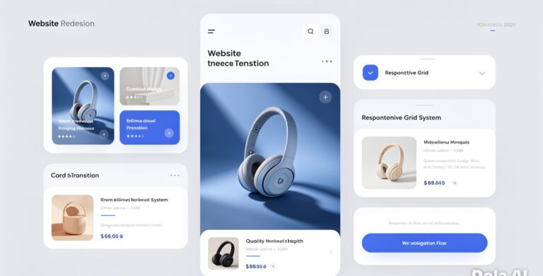
Streamlining Complex Workflows with Intuitive UI Components
Ever opened a SaaS dashboard and just… stared at it? Like, “Where do I even start?” That’s not just bad design. It’s a missed opportunity.
Back in 2023, I was consulting for a logistics SaaS startup handling fleet management. Their devs had packed in features galore, but the UI was overwhelming. Drivers were struggling to locate the basic task entry form without calling support. We stripped back the interface, introduced collapsible menus, emphasized primary actions with smart color cues, and added task-based tabs. Surprisingly, these small tweaks slashed support tickets by 40% in under three weeks. And user satisfaction? Through the roof.
Here’s what matters:
- Prioritize primary tasks: Surface high-frequency actions. If users log in 10 times a day for one reason, make that action front-and-center.
- Modular interfaces: Let users hide or drag independent modules around. Flexibility boosts usability.
- Progressive disclosure: Don’t dump all options at once. Reveal elements as needed. It keeps things neat and mental load low.
Solid UI components aren’t bells and whistles. They’re decision-making scaffolds.
Optimizing User Onboarding Through Guided Design
Onboarding is your first handshake. The first conversation. And first impressions? They linger.
I still remember testing an early version of an AI writing tool back in early 2024. Within seconds of logging in, a slide-out guide showed me around with lighthearted tone and purpose-driven tips. Instead of dumping me in a dashboard desert, it pointed to the next step. Write a headline. Want to improve it? Here’s a prompt suggestion. Want to export? Let’s guide you there too. Five minutes in, I already felt like a power user.
Here’s what works now:
- Contextual walkthroughs: Use in-product tutorials that respond to what the user is doing. Static walkthroughs? They’re relics.
- Micro-feedback: Small animations, toast messages, and success checkmarks show progress without screaming for attention.
- Personalization: Use data from initial user inputs (like industry or role) to surface relevant content or hide irrelevant stuff.
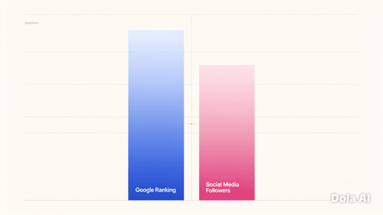
Research by the Nielsen Norman Group in late 2024 showed that adaptive onboarding trails (those that change based on user behavior) improved SaaS retention by 21% over four weeks. That’s not just a bump. It’s a lifeline in the battle for churn reduction.
Designing Across Devices: Mobile, Tablet, Desktop
Responsive design isn’t just about resizing content anymore. It’s about reshaping experiences.
Picture this: A project management app looks pristine on a 27” monitor. But on a smartphone? The Gantt chart becomes a labyrinth. I worked with a client last year who faced this exact problem. We restructured their mobile experience entirely: switched timelines to vertical scrolls, swapped mouse-hover tooltips with swipe gestures, and re-prioritized views. Engagement on mobile jumped by 50% in beta testing.
The point? Users expect device-native designs, even if it’s the same product.
Here’s the cheat sheet:
- Design with mobile use cases in mind first, not just as a backup plan.
- Test on actual devices, not just simulated ones. A trackpad doesn’t replicate thumb pain.
- Prioritize tap targets: Small buttons on touch screens? UX nightmare.
- Offline support & local caching: Non-negotiable for global apps with fluctuating connections.
The WebAIM 2025 review emphasized accessibility in mobile UIs as critical to usability rankings. Mobile-first isn’t just trendy. It’s foundational.
Final Thoughts
Great UI isn’t about showing off clever design tricks. It’s about empathy. Understanding how users think, what trips them up, where they hesitate. And fixing that before they even notice.
The strongest SaaS apps in 2025 are those that melt complexity into clarity, reduce the learning curve to a gentle slope, and allow users to flow from login to value without friction.
So, if you’re designing or revamping your platform, ask yourself: Where are my users struggling? And then. Fix that. Because design is never just aesthetic. It’s how your users feel seen, heard, and understood. And there’s nothing more powerful than that.
Ready to elevate your SaaS experience? Drop me a line or share how your team is tackling UI design this year. I’d love to hear your insights.
Frequently Asked Questions
What’s the biggest UI design mistake SaaS teams make today?
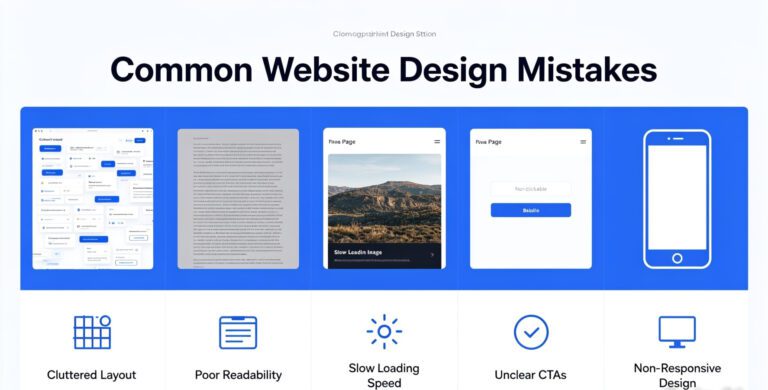
Trying to cram too many features into the main interface. People think more options mean more value, but it’s the fastest way to confuse and overwhelm users. Prioritize clarity over capability. You can surface advanced features later through progressive disclosure.
How do I know if my onboarding is effective?
If users are emailing support, Googling use cases, or dropping off before they complete a core task, it’s a red flag. Try session recording tools like FullStory or Hotjar to see where they hesitate. Also, a good onboarding UX guides users to value in under 3 steps.
Should we design mobile-first or desktop-first?
It depends on your target user. But in 2025, with mobile usage soaring even in enterprise environments, mobile-first is often the safer bet. Start with core flows optimized for small screens. Then layer on functionality for larger devices.
Are animations and microinteractions worth the dev time?
Absolutely. If used wisely. Research by Interaction Design Foundation (2024) shows that subtle microinteractions boost task success rates by up to 18%. They guide and reassure. Just don’t go overboard. Avoid anything that feels like flair for flair’s sake.
How do I balance customization with simplicity?
Let users opt into complexity. Out of the box, show a clean, focused UI. For power users, add toggles or settings that unlock advanced views. This layered approach respects both new users and pros without overwhelming either group.