It’s 2025, and if your website still treats mobile design as an afterthought, we need to have a serious conversation. The days when you could launch a desktop-first site and retrofit it for mobile “later” are long gone. Truth is, there is no “later.”
Mobile-first design isn’t just a smart move anymore. It’s the standard.
And that shift isn’t just about looking slick on a smartphone. It affects your visibility in search, your ability to convert visitors, and ultimately whether your digital presence thrives or fizzles out.
Let’s break down what this means for where we are now, and how you can thrive in a mobile-dominated web.
Google's Stance: Mobile-First Indexing Is the Rule
Google made its position loud and clear back in 2019 when it rolled out mobile-first indexing as standard for all new websites. By 2023, every page in the index was being evaluated based on the mobile experience.
Put simply? Google looks at the mobile version of your site. Not the desktop one. When deciding how to rank you.
And here’s the kicker: if your mobile content is lacking, stripped down, or just flat-out broken, that’s the version of your site Google sees. Not the glossy desktop layout you spent weeks perfecting.
I’ve seen this happen firsthand with a client in the travel sector. They had killer desktop content. Rich with destination photos, immersive copy, and well-placed CTAs. But the mobile site? It hid half the images, condensed paragraphs beyond recognition, and buried their booking button. Their organic search traffic saw a 37% drop… and fixing the mobile layout brought most of it back.
Designing for Small Screens Isn’t Just Shrinking Things Down
A smaller screen doesn’t mean a smaller expectation from users. In fact, it raises the stakes.
We’ve all experienced a mobile site where the menu disappears or the text jumps around if you so much as breathe. It’s infuriating. And most of us bounce before digging further.
Designing for mobile-first means rethinking hierarchy:
- Start with your most vital content. On mobile, folks scroll fast and tap faster. Make sure your core value is clear fast. Ideally above the fold (or at most, within a quick swipe).
- Strip the fluff, not the function. If you have 10 features, mobile doesn’t need all 10 up front. But your most-used tools or hottest product needs to be obvious.
- Test everything on real devices, not just simulators. I’ve caught bugs in mobile navigation buttons that worked in Chrome DevTools, but broke on my actual Android phone.
One favorite piece of advice I got from a UX strategist: “If it isn’t working on your phone in line at the grocery store, it isn’t working.”
CTAs That Work. Because Small Doesn’t Mean Subtle
Clumsy thumbs, small buttons, and modal popups that never quite fit the screen… these are conversion killers.
Your call-to-actions have got to be easy to see, easy to tap, and most of all. Timely.
Here’s what’s been working for my clients lately:
- Sticky bottom CTAs: Subtle, always-visible buttons like “Book Now” or “Chat With Support” stay accessible without taking over the experience.
- Single-action screens: Instead of giving people a giant list of options, show one clear path per screen where possible.
- Feedback you can feel: A tap should do something. Change color, animate a bit, open feedback. That response lets users know something’s happening, and reduces accidental taps.
Conversions go up when people know where they’re going and how to get there. Even if it’s with one thumb while juggling groceries and a phone call.
Site Speed = Search Ranking (and Not Just Slightly)
This one’s not up for debate anymore. Google explicitly considers mobile page speed and performance as a ranking factor.
Research published by Google in 2023 highlighted that pages that loaded in under 2.5 seconds had a 70% higher chance of landing on page one of search results compared to those that took longer than four seconds. That number hasn’t gotten kinder in 2025.
Here are key performance factors that keep showing up in Core Web Vitals reports:
- Largest Contentful Paint (LCP): Make sure the biggest element. Like a hero image or headline. Loads fast.
- First Input Delay (FID): The site needs to respond fast when someone taps a button.
- Cumulative Layout Shift (CLS): No jumpy layouts. If your CTA moves when the page loads, that’s bad news.
And yes, these indicators are even more sensitive on mobile due to inconsistent data speeds, especially in regions still limited by 4G or congested networks.
I’ve worked with an e-commerce brand that shaved 1.2 seconds off their mobile load time. It bumped their mobile conversion rate from 1.8% to 3.6% within two weeks. That translated to a six-figure difference in revenue for one product line alone.
Yeah, It’s Work. But It’s Worth It
Building mobile-first takes planning, testing, and rethinking old assumptions. But if you’re building digital experiences in 2025 and not starting from the small screen up… you’re building for a past that no longer matters.
It’s not about catching up anymore. It’s about staying relevant.
The good news? The tools, frameworks, and design resources today make mobile-first a whole lot easier to get right. Especially when you prioritize clarity, responsiveness, and stripped-down user intent.
And remember: your users don’t care how slick your desktop site is. They care that your mobile experience makes their life easier.
So ask yourself this: Is your site delivering on mobile just as well. If not better. Than it does on desktop?
If you’re not sure… maybe it’s time to find out.
Frequently Asked Questions
What is mobile-first indexing exactly?
Mobile-first indexing means that Google predominantly uses the mobile version of your site for indexing and ranking purposes. This shift began in 2019 and became the norm for all websites by 2023. If your mobile site has less content, poor structure, or broken functionality, that’s the version Google sees. And ranks.
Does mobile-first design also affect desktop performance?
Yes, but in a good way. Starting with mobile constraints often results in cleaner code, faster load times, and a leaner overall design. These improvements typically translate into better desktop performance too. Especially in terms of speed and conversion logic.
How do I test if my mobile site is performing well?
There are several reliable tools:
– Google’s Mobile-Friendly Test
– PageSpeed Insights
– Chrome DevTools’ Lighthouse reports
These tools show issues related to speed, mobile usability, and elements like tap target sizing or layout shifts.
Are there specific frameworks or tools built for mobile-first design?
Absolutely. Popular front-end frameworks like Tailwind CSS, Bootstrap 5, and Foundation include mobile-first breakpoints by default. Most modern CMS platforms like WordPress, Webflow, and Shopify also have themes that follow this philosophy.
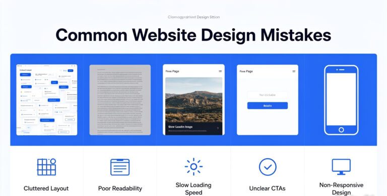
What's the most common mobile UX mistake?
Overstuffing. Trying to cram every desktop element into a tiny screen is a recipe for frustration. Prioritize primary actions, streamline the layout, and do less, but do it better on mobile. Always test on real devices. And ask actual users for feedback.