Introduction
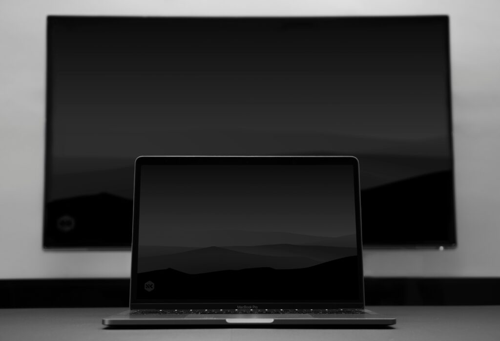
Dark mode design has exploded in popularity. It offers a sleek, modern look and reduces eye strain during late-night browsing.
Understanding Dark Mode
Dark mode reverses standard colour palettes. Light text appears on dark backgrounds, creating smoother contrast and better readability.
Benefits for Users
Users experience less glare and fatigue. OLED screens consume less power. Accessibility also improves with balanced contrast.
Colour and Contrast Guidelines
Avoid pure black or pure white. Use dark grey backgrounds. Ensure a minimum 15:1 contrast ratio between text and background.
Typography and UI Elements
Choose readable fonts. Soften harsh tones. Use accent colours for buttons, links, and call-to-actions.
Testing Across Devices
Test your dark mode theme on multiple devices and browsers. Adjust saturation and brightness for consistency.
Accessibility Considerations
Add a toggle for users to switch themes easily. Support both modes with adaptive CSS or JavaScript.
Conclusion
Dark mode looks stylish and feels comfortable. When designed carefully, it enhances usability and gives your site a modern edge.


