When you stop and think about your favorite brands, what’s the first image that flashes in your mind? Odds are, it’s their logo, right? That little symbol packs way more punch than you’d expect. It sparks emotion, tells a bit of a story, and somehow sticks with you like that one song you can’t stop humming.
But here’s the thing I’ve picked up on after more than a decade in branding and design: making a great logo isn’t about tossing together something that just “looks nice.” Nope. It’s about crafting a visual that speaks. Like, clearly and confidently… and it needs to do that every single time.
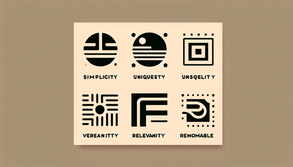
So then, what actually makes a logo not just good, but great? Let’s get into the five must-haves that every strong brand logo needs. This comes from real work in the field and a whole bunch of late-night design sessions fueled by tea and trial-and-error.
1. Simplicity: Less Really Is More
Oh man, I still remember this one time I pitched a logo to a small coffee shop owner in Exeter. She wanted to include everything under the sun – coffee beans, steam swirls, like even her dog Bella. Sweet idea, but it just wasn’t clicking. Finally we stripped it back to a clean silhouette of a coffee cup with a subtle little paw print. That’s when it clicked. People noticed it right away. They remembered it. They actually talked about it.
So yeah, effective logos are simple, but not boring. Think Apple, Nike, McDonald’s. No mess. No fluff. Just the core.
Lorem ipsum dolor sit amet, consectetur adipiscing elit. Ut elit tellus, luctus nec ullamcorper mattis, pulvinar dapibus leo.Lorem ipsum dolor sit amet consectetur adipiscing elit dolor
John Doe
Quick Design Insight:
According to a 2022 study in The Journal of Marketing Research, people tend to remember and trust minimalist logos more. Turns out our brains are wired to recognize clean, pure shapes pretty easily. Makes sense, right?
2. Memorability: Make It Stick
You ever see a logo once and then it just floats around in your head like you’ve known it forever? That’s memorability doing its thing.
It’s not always about having something loud or flashy, though. It’s more so about being distinct. Like, I worked with this lovely candle brand in Totnes not too long ago. We tried out a bunch of cool ideas, but the one that nailed it? A flame shape hidden right inside the letter “A.” People started asking for the brand by name within a few weeks.
A memorable logo doesn’t fade into the crowd. It finds its own little corner and owns it.
3. Relevance: Speak Their Language
Imagine a makeup brand using a robotic, metallic font. Yeah… doesn’t feel quite right, huh?
Your logo has to match your audience. Not just kinda… it needs to feel like it belongs in their world. Whether it’s about tone, colors, or even how polished the thing looks. Like this pub in Plymouth I once worked with wanted a tech-style look with jet blue lines and all sorts of modern vibes. But their place was cozy and rustic with old wooden beams and all that. We convinced them to go with a hand-drawn badge design instead, and honestly? It worked. Customers felt the vibe instantly.
Bottom line? Relevance isn’t about being obvious. It’s more about being intentional so that people just… get it.
4. Versatility: It Needs to Work Everywhere
You’d be amazed how many logos totally fall apart once they get shrunk down or thrown into a weird format. Like, I’ve seen fancy designs with lots of gradients and tiny little text that disappear the second you print ’em on a receipt.
A real logo needs to function at any size, any color way, any context. Whether you’re putting it on a billboard or a tiny sticker, it should still look solid.
Handy Pro Tip:
Whenever we design logos, we always test them in a few main ways:
– A tiny digital thumbnail
– Printed on a white background
– Printed on a dark background
– A grayscale or black-and-white version
– A single-color embroidery mockup
If it still works in all of those? You’re good to go.
5. Timelessness: Avoid the Trend Trap
Trendy designs are like fast food. Tasty in the moment but don’t really stick with you.
I’ve seen too many brands sink a ton of time and money into logos that followed a hot design trend… only to rebrand 2 or 3 years later after it all felt outdated. Stuff like “glitch” effects or ultra-minimal flat styles might be cool right now, but they don’t always age well. And rebranding? Super expensive, both on your budget and your brain.
Look at brands like Coca-Cola. That logo’s barely changed in, what, a century? It still works. It’s got style, not trend.
So yeah, when I design logos, I aim for long-haul style. Not what’s vibing on Instagram this month. If people still vibe with it 10 years from now, then you’ve done something special.
Final Thoughts
Awesome logos don’t just magically appear. They’re built with care, research, and a whole lotta heart. Each of the five elements – simplicity, memorability, relevance, versatility, and timelessness – plays its role in creating a visual identity that’s built to last.
If you’re a small biz owner or heading up a startup, and you’re trying to bottle your dream into one visual mark, don’t stress about perfection. Focus on clarity. Work with a designer who listens, digs deep, and gives your brand the love it deserves.
Your logo? It’s probably gonna be the first “hello” your brand ever says. Make sure it’s saying exactly what you mean.
Wanna build a logo that really speaks for your biz? Let’s chat. We love helping Devon’s brands look as awesome as they feel.
Frequently Asked Questions
What makes a logo “timeless” right now?
A timeless logo keeps away from what’s hot today and leans into classic rules like balance, clarity, and being adaptable. Think fonts and shapes that don’t scream “2023 only.” A good gut check? Ask yourself if it would’ve looked great 10 years ago and will still hold up 10 years from now. If so, you’re on the right track.
Is simplicity always the best route?
Yeah, most of the time it is. Simple logos are easier to remember and use across stuff. That being said, a teeny bit of detail or flair can add character, just. Don’t go overboard. As designers, we usually find that sweet spot right between clean and cool.
Can logos change over time?
Totally. Lots of big brands tweak their logos over time to stay fresh but still feel familiar. The idea is small changes, not a complete overhaul. Stuff like adjusting the color or spacing or maybe modernizing the font can go a long way without losing your identity.
Should my logo always include my name?
Not always. Big-time brands like Apple or Nike can get away with just a symbol, but if you’re smaller or just starting out, including your name helps people remember and recognize you. Once folks know who you are, you can consider simplifying.
How much should a pro logo cost?
It kinda depends, honestly. Freelancers might start around a few hundred pounds, while agencies can go up from there. It’s not just about the logo file though. It’s the strategy, research, and long-term value that makes it worth the spend. A solid logo helps people trust you and remember you. That’s pretty priceless, yeah?