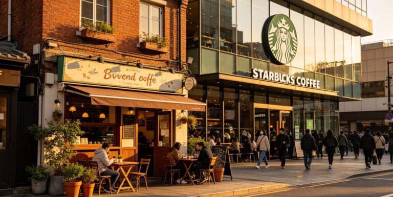
Every time I stroll through Totnes or take a lazy drive through the lanes near Exeter, I always find myself stopped in my tracks by certain brands. And it’s not like it’s always something loud or flashy. Nope. Sometimes it’s just a really well-placed logo on a soft pastel coffee cup, or like, the way a little shop balances its window display with the right typography and negative space. That kinda stuff really sticks with you.
That’s the quiet power of a solid visual identity. It connects. It captivates. And yeah, it stays with you.
But what exactly makes a visual identity stand out? How come some Devon brands feel both timeless and totally now? Like they’ve been around forever, but also feel brand new every time? I’ve had the pleasure of working with a bunch of local businesses. From cozy bakeries tucked into coastal villages to young, fired-up tech startups in Exeter Science Park. And honestly, when the visual language is really thought through, it can completely level up how a business is perceived.
Why Visual Identity Just Hits Different in Devon
Devon’s got this unique vibe, y’know? There’s something kinda special about the way people do business here. You’ve got fifth-generation family-run shops sitting right next to barefoot surf cafés serving oat milk lattes. And every one of those businesses carries its own rhythm and story. That’s where visual identity comes in… it kinda becomes the translator of that story.
Like take Salcombe Sea Glass for example. Tiny shop, mighty brand presence. They redid their logo recently, and now it’s just got this peaceful, flowing feel. The new curves echo the sea, and their colors reflect soft sand and gentle waves. It’s subtle, yep, but dang it’s effective. Visitors see their branding from ages away, and locals? They wear their pieces like a badge of pride. Trust me, that ain’t a fluke. That’s intention.
What Makes a Visual Identity Actually Work?
Alright so let’s unpack this a bit. A proper visual identity isn’t just slapping a nice-looking logo on everything and calling it a day. It’s gotta run through every part of your brand. The packaging, your website, staff uniforms, Insta posts… even your chalkboard sign. If it’s all over the place? Your customers are gonna feel lost.
Here’s what Devon’s most standout brands tend to nail:
1. Clarity and Simplicity
Simple doesn’t equal dull. It means… focused. Brands like Riverford Organic Farmers get this completely. Their earth-toned palette, sketchy hand-drawn bits, no-fuss typefaces all scream: hey, we’re organic, ethical and keeping it real. No frills, just purpose. This minimalist design approach can significantly boost your brand’s identity.
2. Consistency is Key
Whether you’re holding their branded box or scrolling through their stories on social, the whole look and feel stays the same. And that? That builds trust. Consistency is what makes someone go “Oh yeah, I’ve seen this before.”
3. Core Values at the Center
Here’s the thing. Chasing trends that don’t match your actual vibe? Big nope. Brands like Dartmoor Brewery don’t bother trying to be something they’re not. Their rugged, grounded aesthetic mirrors the wild moors they’re built on. The branding feels rooted. Feels real.
4. Heart & Emotion
Okay, it sounds cheesy, but like, emotional design works. When your brand makes someone feel something. Nostalgia, excitement, comfort. It sticks. Take Moss & Fern, a dreamy little café. Their soft greens, creamy whites, wavy edges… it’s like stepping into your nan’s greenhouse. Proper cozy.
5. Standing Out Without Screaming
Being memorable isn’t about being the loudest in the room. Sloop & Anchor, a coworking space in Bideford, did this wicked thing with quirky illustrations and rich navy blues. It’s playful, but still grown-up. It’s modern, but not cold. Actually matches the creative energy inside. Many businesses are incorporating custom illustrations to achieve this distinctive yet authentic feel.
Lessons From Local Rebrands That Were Totally Worth It
Let’s be real. Not every business hits it out the park on day one. A lot of the most iconic Devon brands had to course-correct along the way. But instead of scrapping everything? They built on what already made them special.
I got to help rebrand The Ivy Street Market over in North Devon. What started as a pop-up was turning into something bigger. They had amazing products. Local jam, pottery, fabric goods. But visually? Bit of a mess. Mismatched fonts, clashing colors, a logo that kinda looked like a clipart strawberry.
We didn’t flip it upside down though. We refined what was already there. Picked a color scheme inspired by their most popular cherry jam. Built a logo system that could flex for seasons or special events. Six months later? Sales jumped 28%. But more than that, people started saying “It feels like a real brand now.”
Lorem ipsum dolor sit amet, consectetur adipiscing elit. Ut elit tellus, luctus nec ullamcorper mattis, pulvinar dapibus leo.Lorem ipsum dolor sit amet consectetur adipiscing elit dolor
John Doe
Where Do You Go From Here?
Whether you’re mixing up handmade bath salts in Tavistock or building a new app in Plymouth, your visual identity is more than just how things look. It’s how you connect. It’s how you tell your story without saying a word.
If your brand still looks like something you cobbled together at 2 am with a free Canva template (hey, we’ve all been there), maybe it’s time to rethink. Or at least press pause and ask:
- Are your visuals still saying what you mean?
- Do they help or kinda hurt your credibility?
- Can someone glance at your stuff and just get it?
Because yep, folks do judge a book by its cover. But the cool part? You get to rewrite that cover whenever you want.
So go on. Design like you give a damn. Devon’s watching, and we’re here for it.
Frequently Asked Questions
What all counts as part of a visual identity?
It’s more than a logo, mate. It’s your colors, typefaces, photo style, layout vibes, any little icons or textures you use. Basically, it’s the full look-n-feel of your brand across anything people see. Online, on paper, on your packaging, all of it.
How often should I update my branding?
There’s no strict timeline, but lots of businesses revisit their visual identity every 5 to 10 years. Or anytime there’s a big shift. Like a new audience, new services, or a whole new vibe. Sometimes all you need is a little refresh instead of a total rewrite.
Can small businesses afford good branding?
For sure. You don’t need some fancy London agency. Loads of brilliant local designers offer solid, affordable packages. Good design early on saves you headaches (and money) down the line.
How can I tell if my branding is actually working?
Watch how folks respond. Are they tagging you online? Coming back for more? Telling their mates about you without needing a reminder? If things feel quiet or confused, your visuals might not be pulling their weight.
What branding trends are big for 2025?
Minimal-but-personal is still going strong. Think clean layouts but with custom illustrations or unusual type. Brands are leaning into what makes them them. Oh, and making sure stuff looks great on screens big and small? Not optional anymore. That’s a must. Keep an eye on the graphic design trends shaping Devon’s creative landscape.
So yeah, don’t sleep on your brand visuals. They’re telling your story, even when you’re not around to explain it.